Sage 300 plugin software developers Orchid Systems asked Communica for a website re-design to help them stand out from their competitors, and bring some clarity and calm to a detailed and technical product range.
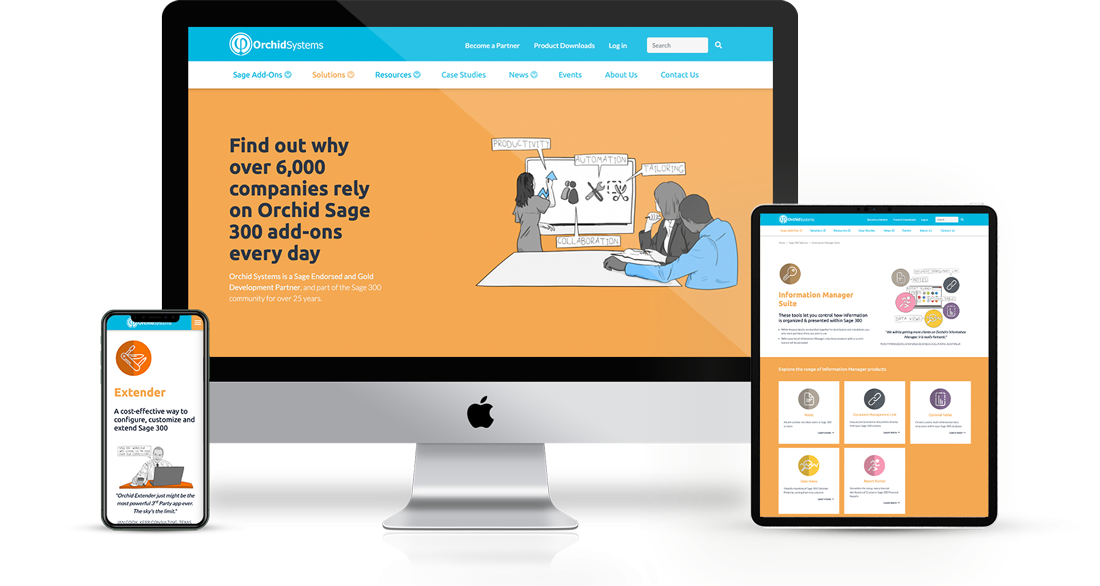
We worked with them on content architecture and design, to break their large, information-dense product pages into easily-digestible layouts, make them mobile-friendly, and to incorporate drawings from their in-house illustrator into a new look and feel.
The Drupal/Gutenberg editing experience makes layouts flexible.
As the amount of content required for products and ranges varied across their software, from simple one purpose plugins to complex customisation suites, we implemented a similarly unique approach to the product pages.
Gutenberg, a rich content editor, allows their editors to build effective product landing pages using a variety of predefined section layouts and colour schemes, combining them into a unique layout as required. So the site feels at once homogenous and varied.
Gutenberg works well with mobile-friendly styles reflowing content across different devices.
The ability to highlight key product tutorials and information was a must, so they are able to place their related information “learn more” block onto the pages that need it, and reference content with a clear structure.
On-site search helps users find the answers they need, and with some help on SEO as they went, the site is now search-engine and user-friendly.

